Awful Box Art Competition
Anyone who frequents the GIA probably realizes we've got a particular affinity for including box art with media and artwork updates. When you're browsing through the local store trying to decide which game to spend your hard-earned cash on, you'll likely be drawn to the most eye-catching, artistically-inspired, visually-appealing cover which stands out from its lackluster counterparts. Popular examples of good box art include the deceptively simple, yet elegant artistry of Japan's Final Fantasy VII, the colorful patterns of PaRappa the Rapper, and even the funky flying Mario of Super Mario 64.
But what kind of attention do the games with bad box art get? Some, despite brutally laughable designs, reach million-seller status, while others are simply forgotten -- sadly relegated to the back shelf in retailer's stores. The GIA believes in equal-opportunity box art postings, however, so we asked a number of staff members to nominate a favorite piece of bad box art for a special award. It's about time these designs got the recognition they deserve. We'll present the nominations below, then it's up to you to vote and decide upon a winner. Voting will close and the winner will be officially selected on July 7th.
Update: Voting has now closed. Check out the Awful Box Art Competition results to see which piece of "art" won!
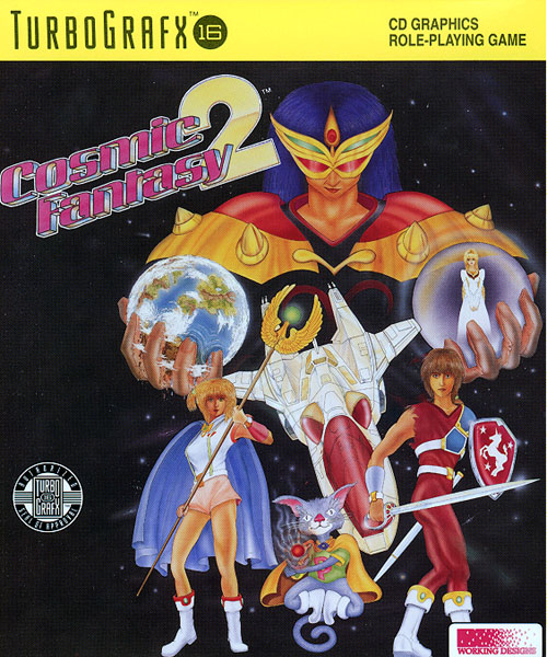
Cosmic Fantasy 2
American game distributors seem to take perverse pleasure in sucking the
life out of games for marketing purposes. Cosmic Fantasy 2 puts this
trend on full, sickening display.
Consider for a moment the game itself: an anime-styled RPG, full of
then-rare cutscenes and brief animated sequences. Cosmic Fantasy is not
a serious series. It's one with stars like Cadet Babbette and Pico the
talking cat. Yet somehow, energetic and quirky was deemed to be the
wrong way to market this game. So mountains of excellent art is tossed
aside, and we're stuck with this, a cover which displays two main
characters with body proportions a Skipper doll would find repulsive,
some sort of grayish cat-thing gawking in the middle like its intestines
had just been yanked out with a hook, and an overlooking villain who
boasts all the menace of a Best of ABBA collection. Said villain is holding two orbs at roughly chest level, perhaps to suggest that they're breasts; gender question issues are raised. Is he a man? Is he a woman dressed like a man? If he's drawn this badly, could any of us tell the difference? All the figures are posed and stiff. They bear no resemblance to anything in the game
itself. The composition makes it look like they were applied to the
starry background like those old water-based sticky tattoos you found in
the bottom of Frosted Flakes boxes. There is no life here, no
intelligence, and no skill.
Who, exactly, this collection of gawky and hideously malproportioned
characters was supposed to appeal to, I don't know. But it's pretty damn ugly.
Nominated by: Allan Milligan
|
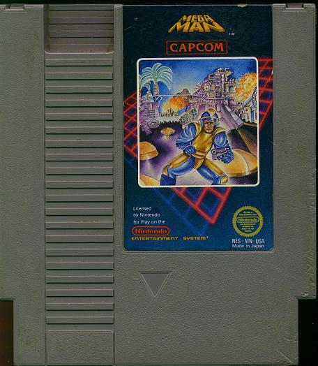
Mega Man
Everyone loves Capcom's quirky prepubescent superhero, Megaman. Fighting for everlasting peace and getting equipped with Bubble Lead, this spunky three-foot tall super guy was liked by everyone. All that goodwill quickly turned to revulsion, however, once gamers got a look at Capcom's cover "art." Instead of a blaster-armed anime superkid, the Mega Man artwork features a middle-aged, constipated midget waddling painfully towards the camera. His normally blue spandex outfit has been replaced by some blue and yellow exoskeletal muscle suit, while his signature blaster arm has been replaced with a handheld Glock he can't even aim straight. Megaman scuttles crablike through a futuristic parking lot, as a castle from "My Little Pony: The Movie" and a poorly lit "Miami Vice" set glare down from the background. If ever there was box art which said, "don't buy this game," Mega Man is it.
Nominated by: Andrew Vestal
|
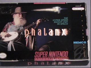
Phalanx
I've never been much of a shooter fan. My reflexes were too slow in my
childhood, and as I grew older I wanted more from a game than twitch
action. Nevertheless, I feel qualified to say that the box for the SNES
game Phalanx features the single least desirable mascot for a futuristic
blast-a-thon bristling with lasers and special weapons ever: an old man
on his front porch, playing a banjo. It's not ugly art (though I can't
imagine the gamer, who's actually attracted to a wrinkle-laden geezer)
but it's just so inappropriate.
Moreover, we're getting mixed signals here. As has been established, the
cover features an old man playing a banjo--we're not told, but it's
probably a low- to mid-tempo song played by wrinkled, aged, hands with
pinched nerves and all kinds of muscle ailments. Nevertheless, the caption
advertises a "Hyper-Speed Shoot-Out In Space," which is somewhat at odds
with the decrepit, decidedly nonmoving fogey. So what are we to make of
this? Slow-paced banjo sim or fast-paced shooter? When I first saw it in
stores, I couldn't decide. I stood there, dumbfounded, as the customers
passed by me. I was no stranger to logic-chopping, but the ambiguity of
the thing fried my synapses like an oven at 500 degrees. In the end,
that's why this is such a bad box: the potential for mass confusion and
brain damage with prolonged exposure. This box doesn't just deserve to win
"worst box" award, it deserves to be federally outlawed.
Nominated by: Nich Maragos
|
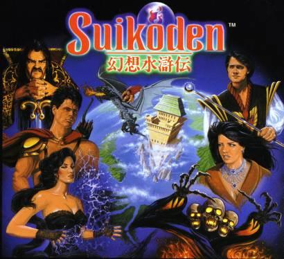
Suikoden
If looks could kill, the hideous abomination that defiles Suikoden's
box would send us scurrying to the afterlife -- it's so bad that I honestly can't
believe anyone would want to buy the game after seeing it. I'm still
embarassed to own something as disgusting as this, which is why I
always my copy of Suikoden tucked securely away in a paper bag -- an
accidental glimpse of it might turn me to stone.
What makes Suikoden's cover so bad? You can't even tell which characters the malformed devil people that adorn it are supposed to represent.
The vaguely human form in the upper left appears to be Emperor
Barbarossa disguised as somebody's slovenly uncle, but that's the
only remotely recognizable character (the vile monster in the lower left
might be Windy were it not for the fact that she has different hair,
different clothes, a different face, and generally doesn't resemble
Windy in any way). And why are dragons flying out of Toran Castle when
that didn't happen in the game? Did the artist even bother to do any
research? And why didn't Konami use the manual cover on the game box?
Some Konami exec must have decided that anything was preferable to
having vaguely anime-style art, and so we ended up with some generic
American fantasy characters that bear absolutely no resemblance to
Suikoden's cast. It's a good thing you can't judge a book (or game) by
its cover, or else Suikoden would be as entertaining as E.T. for the
Atari 2600.
Nominated by: Fritz Fraundorf
|
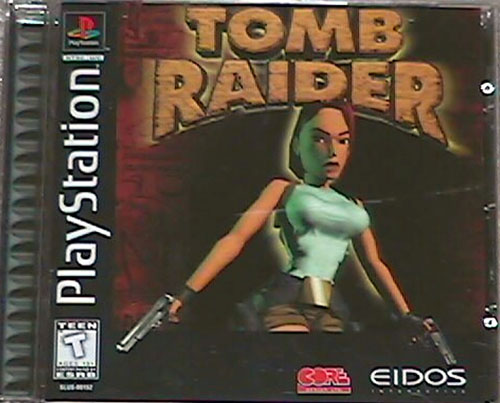
Tomb Raider
When I first saw the Tomb Raider cover art, I just passed it off as the usual insulting attempt to appeal to my hormones. Sure, it sucked, but it wasn't the worst cover art ever. Then I found out that that wasn't an in-game screenshot on the cover. Lara Croft has to be one of the worst professional renders I've ever seen. I've seen better stuff on demo pages for shareware 3D rendering programs. Wow, those softballs under her shirt sure are sexy! I'm really turned on by the pair of engorged leeches where her lips should be! I'm so impressed by that sexy trucker belt she surely purchased at Bubba's Tackle Shop and Eatery.
Seriously, how could anybody look at that... thing on the cover and be turned on, let alone inspired to spend 4 hours editing out her clothes to create a nude photograph for a web site? I think Kazooie has more polygons devoted to her in-game model than Lara Croft has composing her in all of her renders combined. You never do see Kazooie's entire body.
Aesthetically, the cover includes a red wall in the background which vaguely resembles what was probably supposed to be a tomb, and even the logo looks like a sad, sad rip off on the Indiana Jones Logo. Lara is nice and off center, a result of the acid the graphics and character designers were indulging in when they decided Lara Croft was sexy and stuck her human-inspired form into a game. The entire cover looks like they spent five minutes on it. I guess they were just too busy programming unique elements into the game itself. Stuff like spending hours finding an item that is indistuingashable amidst its similarly colored surroundings took a front seat to creating decent box art. I find it entirely sad that there are undoubtedly people who picked this game up because of the box art. You'd think Baywatch would've satiated this country's need for soft unporn by now.
Nominated by: Drew Cosner
|
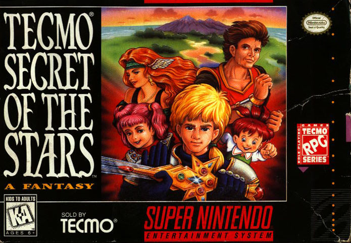
Tecmo Secret of the Stars
Many of the titles up for the awful box art award actually sport decent games beneath their horrid outer shells. Tecmo Secret of the Stars, however, is graced with a combination of a laughably pathetic RPG and a laughably pathetic box art design. The game is a substandard SNES rip-off of Final Fantasy IV introduced years after Square's release, featuring blatantly clichéd plot devices in a hastily-created, awkward gameplay engine. What's found inside the box, however, pales it comparison to the box itself.
One is first struck by the smug 7-year-old hero. With a pile of puffy yellow hair larger than the rest of his body, our suited kid-hero shows off a sword -- complete with plastic jewels -- he picked out of a Fisher Price toy bin found during his Quest of Paradise Island. (The island is artfully visible in the background, and also magically manages to reflect the sunset in a river despite the presence of a large volcano in the way.) His companions during the quest? Moving clockwise from our hero is his cheeky-faced 6-year-old midget love interest, a stationary heroine with flowing long hair held horizontal by a deluge of hair spray, and a warped aerobics instructor with bulging veins who accidentally jogged his way into the game. The remaining character on the box art still haunts my troubled dreams to this day: injected with an experimental growth hormone, this bloated, disturbing little child clad in Oktoberfest attire has been rendered permanently hyperactive with eyes he cannot close and a mouth locked into an open grin. Worse, the drug has sponsored the growth of two extra ponytails and a massive, adult-sized fist.
Tecmo's name is found in three locations on the box to make sure you never forget the company which brought you this monstrosity: "Sold by Tecmo," "Tecmo RPG Series," and "Tecmo Secret of the Stars." Apparently, the company was so proud of the game they insisted the company name be included directly within the title. Can you imagine "Square Final Fantasy Tactics" or "Capcom Resident Evil?" And thankfully, "Tecmo RPG Series" is a threat the company has yet to fulfill.
Nominated by: Brian Glick
(Thanks to Doug "Stom" Hill for the Tecmo scan.)
|
Feature by Brian Glick, GIA
|
|
|
|