| Artist's Commentary
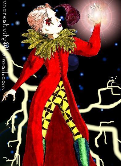
I've been sitting on this picture for quite a long time. I wasn't really
sure whether I did it right or not. I'm still not. I think the background
is a little too cluttered... I think that Kef should have lightning instead
of fire on his hand and the stars should be yellow like lightning to... I
think the torso's too small, his feather's too dark, I should get rid of the
lens flare, etc. etc. etc... but you know, I just sat down one day and
either gave up or decided that it's acceptable. You get to make the call.
^_^
|


