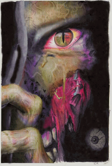
| Artist's Commentary
Well, this started out as a two week project in art class. We had to cut out a magazine article and slice it in
half, then draw the other half in black and white; however, I'm in a second level Art class, when I should be in
a third level, (scheduling problems), so teh teacher gave me a bit of a challenge. The wonderful Mrs. Wolters
told me to cut the ad however I wanted to, then complete it with watercolor. So naturally, I chose a lovely
serene image of a zombie's rotting face peering around a corner. The sections I actually made where the top
section of cloth, the zombie's eye, the seide of it's face, that lovely pulsating vein under it's eye and the rotting
section of mouth, not to mention that eye in the lower corner. The only parts I left in were it's fingers, eyebrow
and most of the facial area above the rotting section. Today I scanned it into Photoshop, and did a little work
with the clone tool to make sections blend better, (gloss prevented the watercolor from going right up to the
magazine print in some areas). Anyhoo, that's about it. This is actually my first "art and photoshop " piece
and it came out pretty well. Thanks to Linda Shi and Andrea Miller for moral support. Andrea, the penguins
look beautiful ^_^ And Linda, regardless of what you think, that still-life is great ^_~!
|


